|
 |
 |
 |
 |
|
|
|
|
|
 |
 |
 |
Methods |
||
|
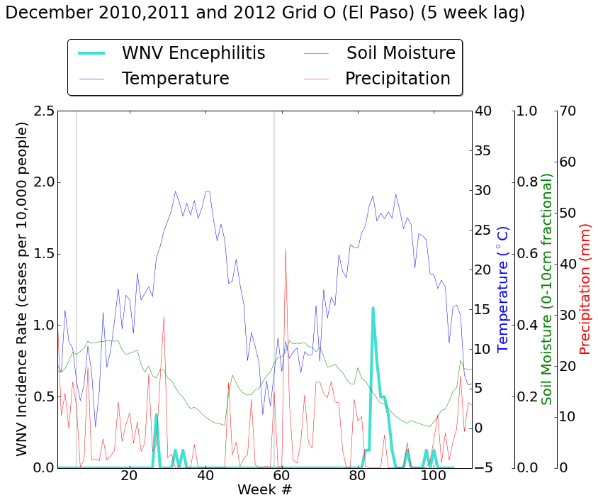
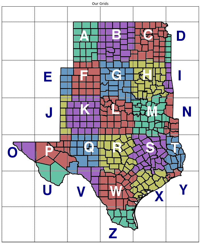
To aid in analyzing our meteorological variables and West Nile Virus (WNV) outbreaks together, we aggregated the WNV data which was reported daily by county, to the same 2.5-degree, weekly grid that our meteorological variables were reported on. This picture represents our grids. We analyzed our data in python by creating time-series arrays of each variable and for encephalitis and non-neuroinvasive cases separately and together. We also used the least squares method to determine simple correlations between the incidence rate for each year and the winter temperature anomalies of the preceding winter, as well as the summer average temperature. | |
Time Series:
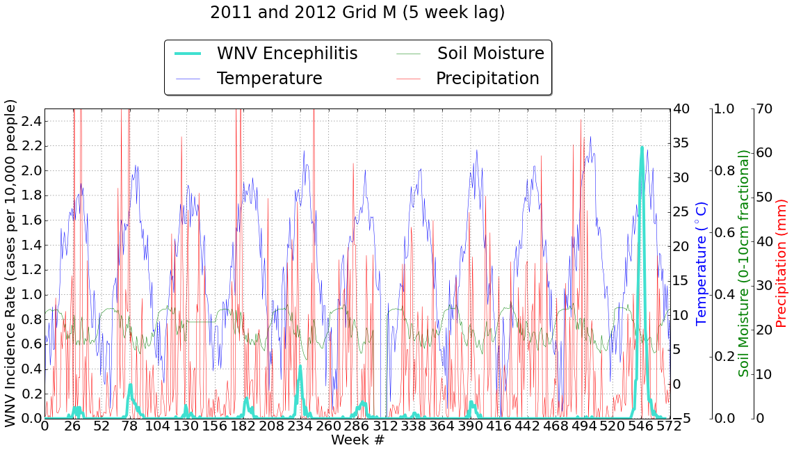
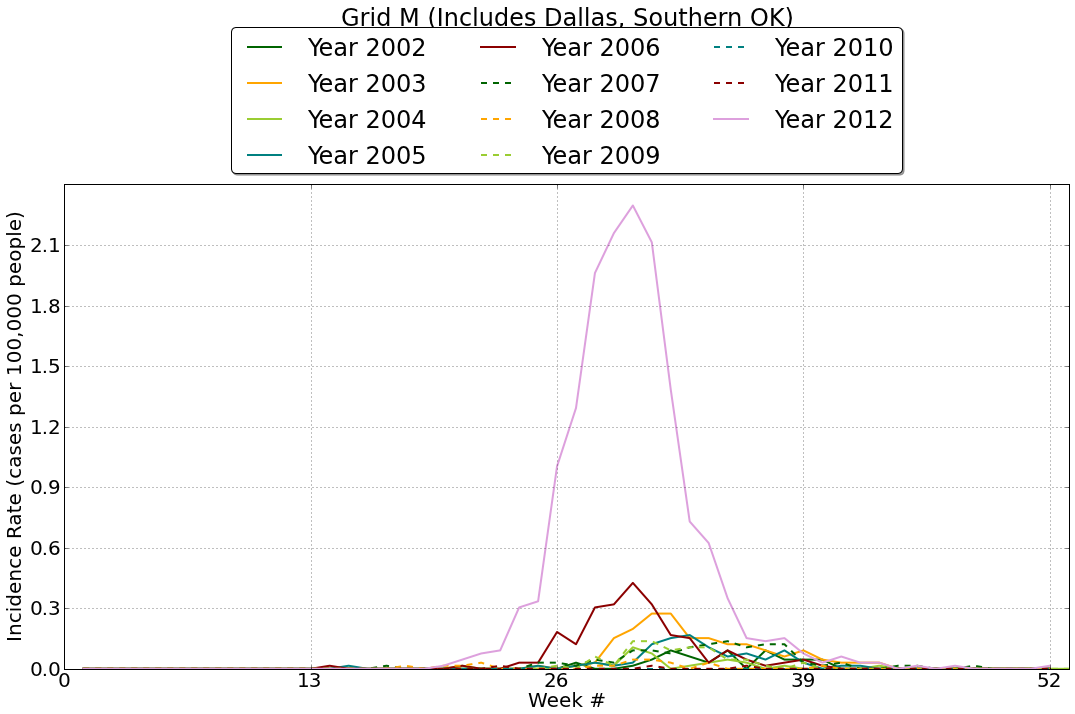
Figure 1:West Nile Virus Cases for Grid M (including Dallas and Southern Oklahoma)
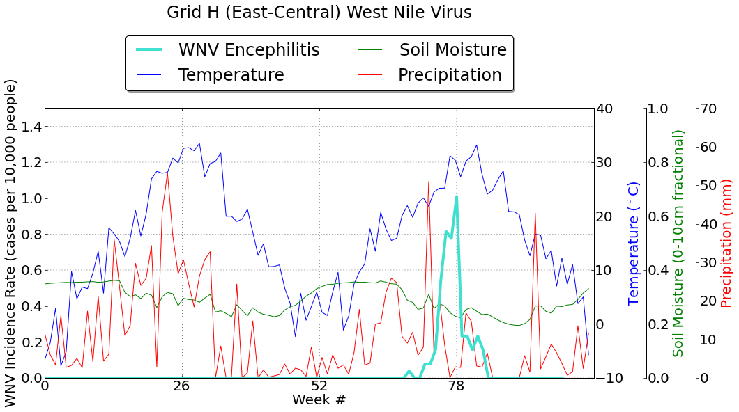
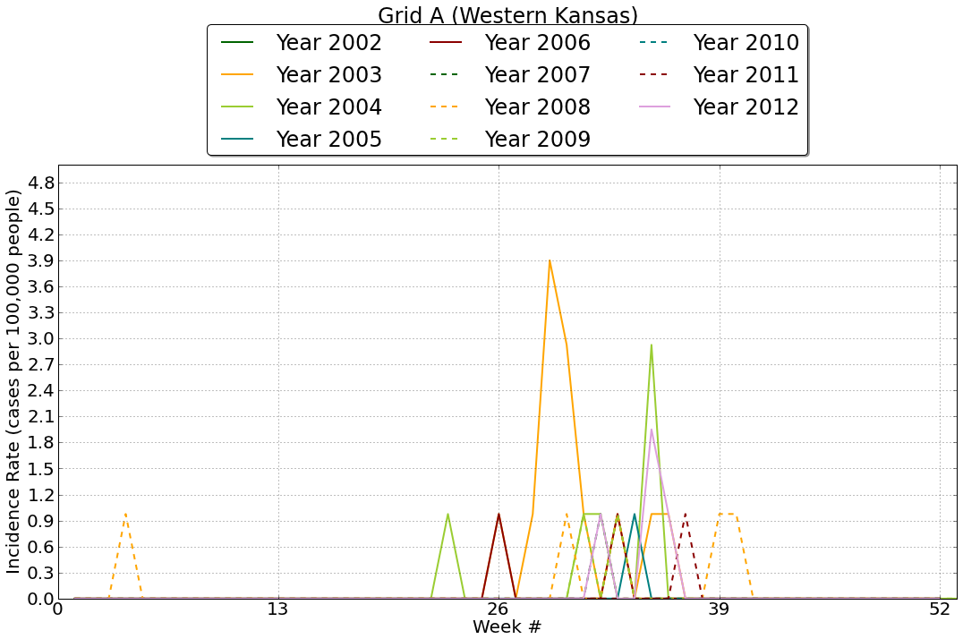
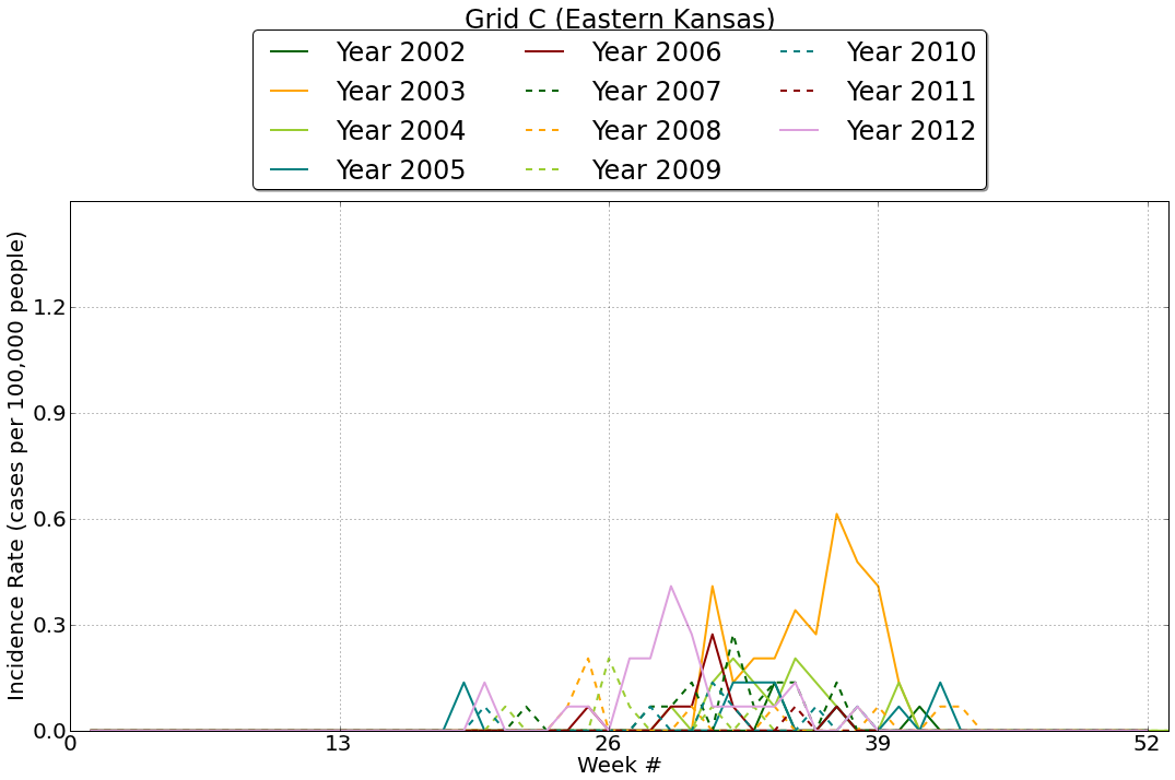
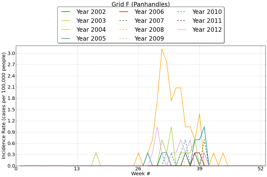
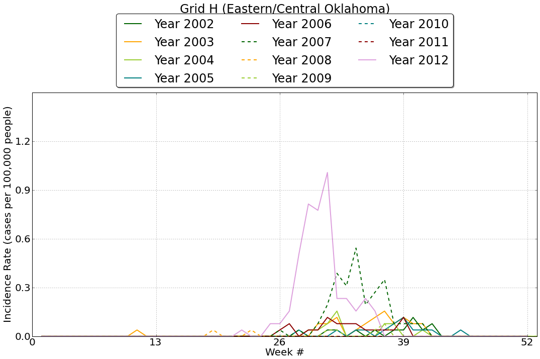
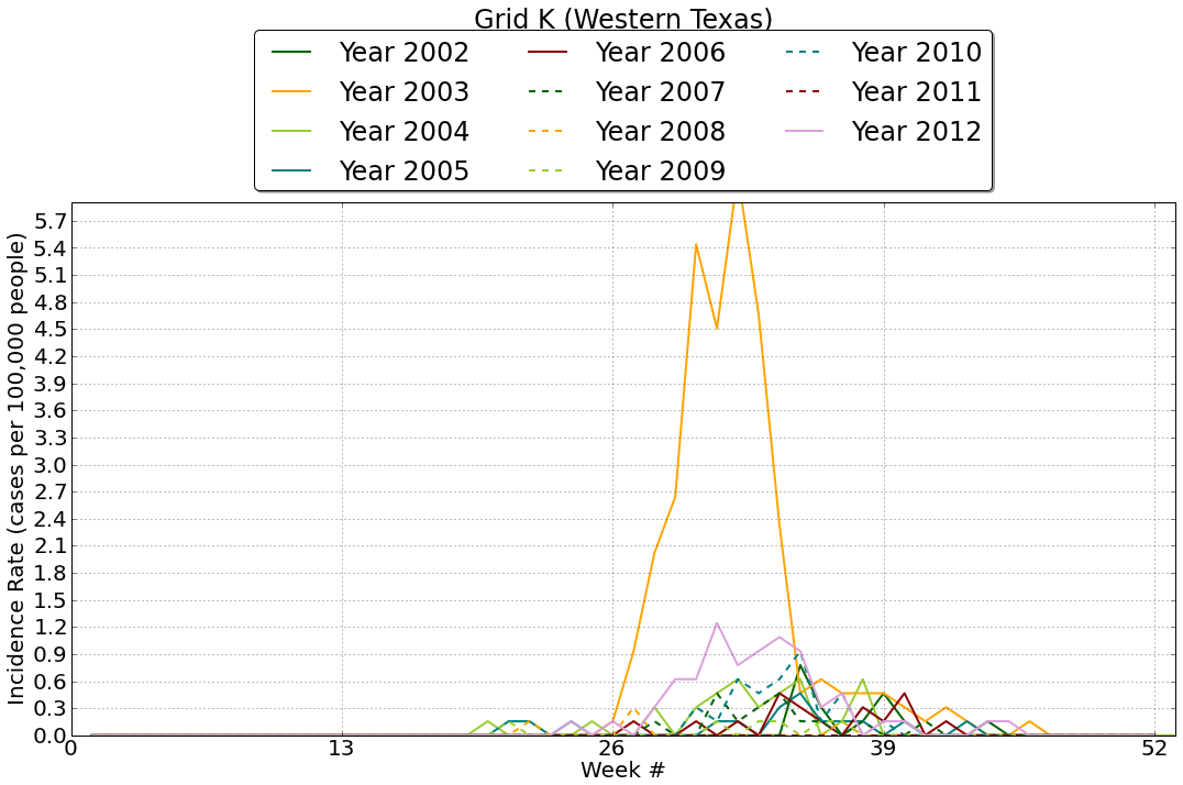
Figure 2:West Nile Virus incidence rates vary widely between 2011 and 2012, which happen to be the lowest and highest years for Incidence Rate respectively. These plots suggest that WNV is likely effected by different processes in our Western Grids than Eastern grids.
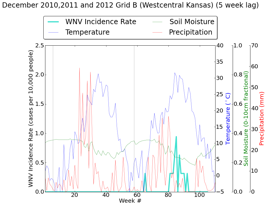
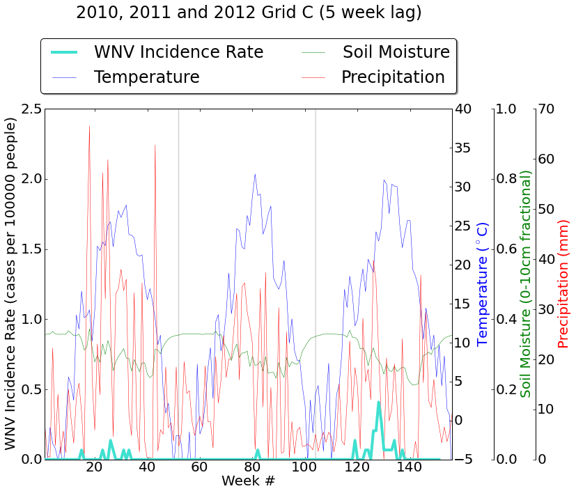
Figure 3:Comparing yearly Incidence Rate trends across our region suggests a few trends: (1) that the infections in the northern areas of the study region begin much later in the year than in the southern areas (especially in the northeast, where meteorological effects are most important), (2) that in general Incidence rates are higher on the High Plains than in the Eastern regions, as has already been discussed, and (3) that higher years in the Eastern area tend to correspond to extremely high years in the west. | ||
Geography
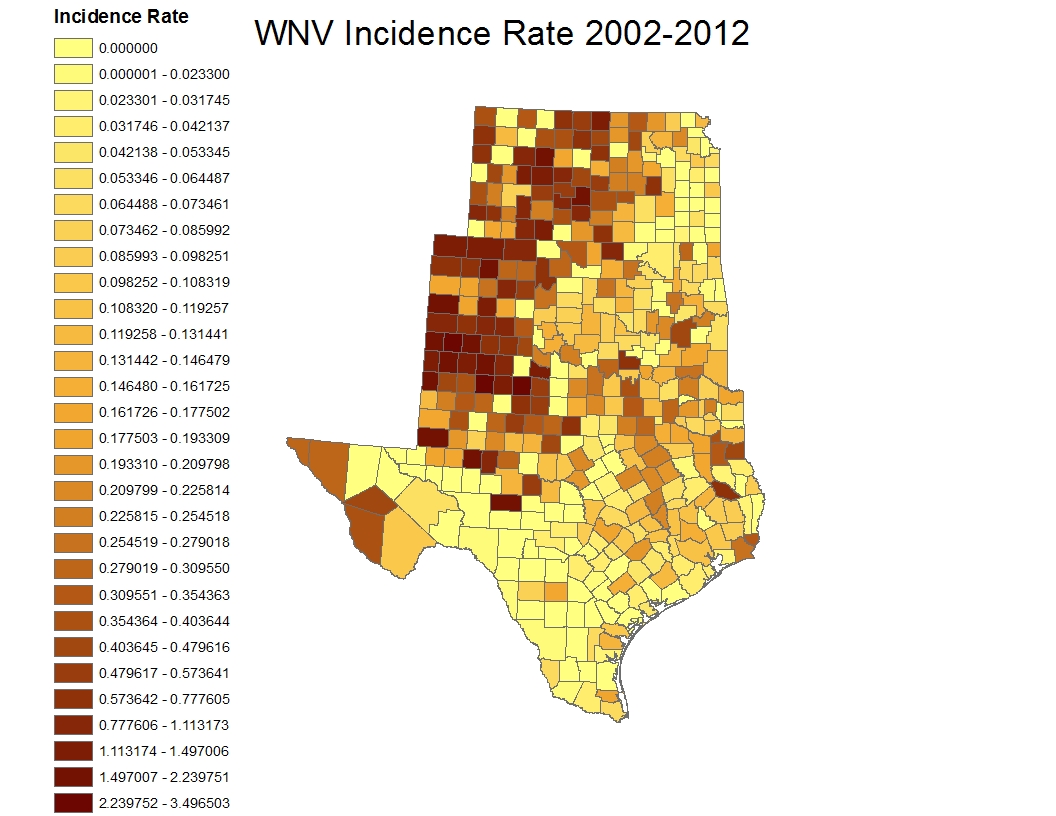
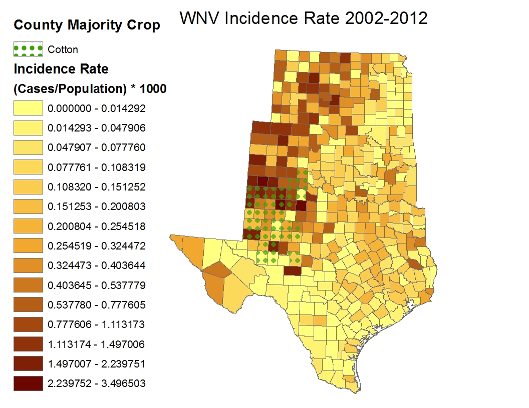
Figure 4:Incidence rates over our entire time period and geographic range revealed that Western portions of our area were most prone to West Nile Virus infections
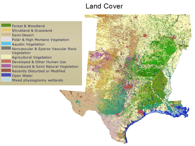
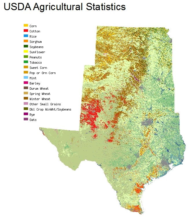
Figure 5:(top-left):Land Cover according to the NLDC Project. (top-right):Agriculture Type from NASS CDL program. (bottom):10 year total Incidence rates overlaid with 33 counties that grow primarily cotton crop. |
||
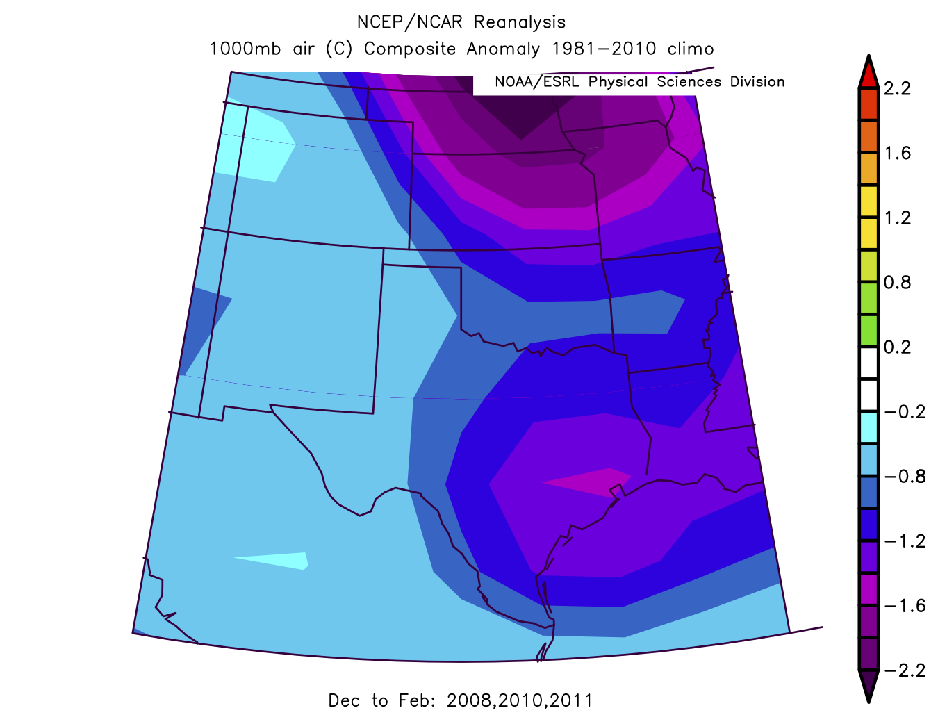
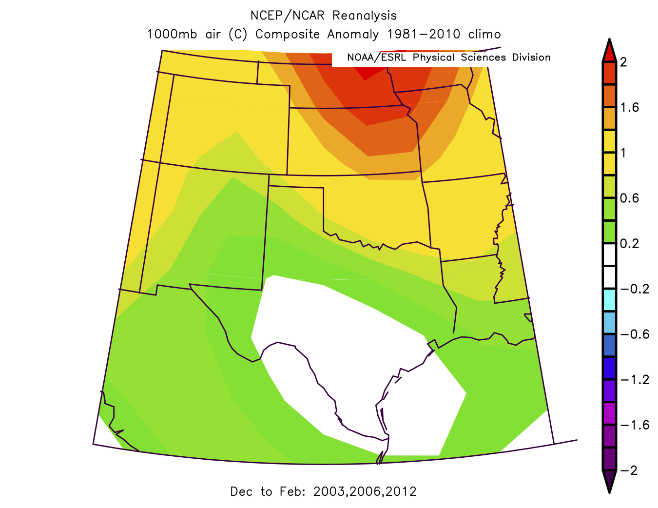
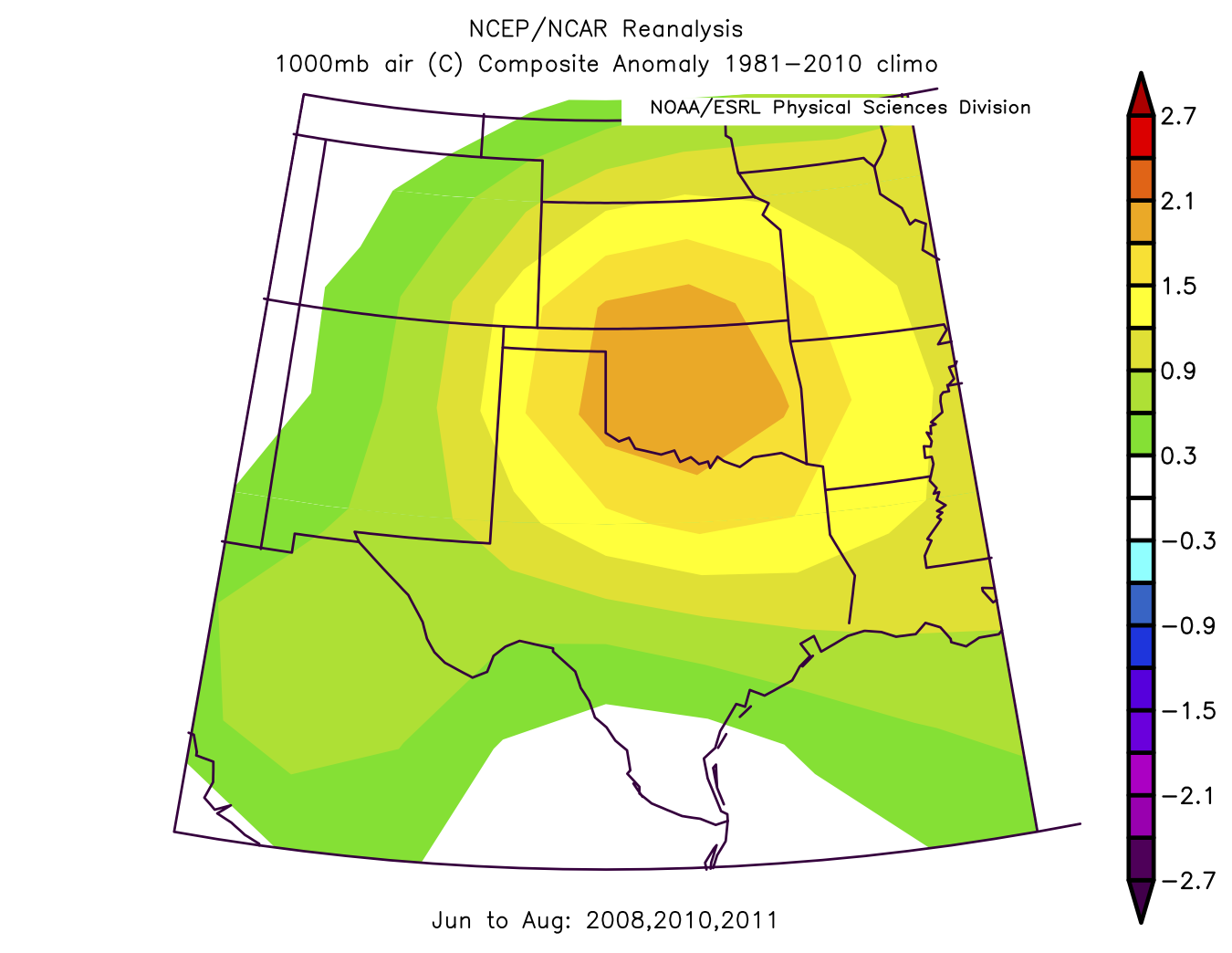
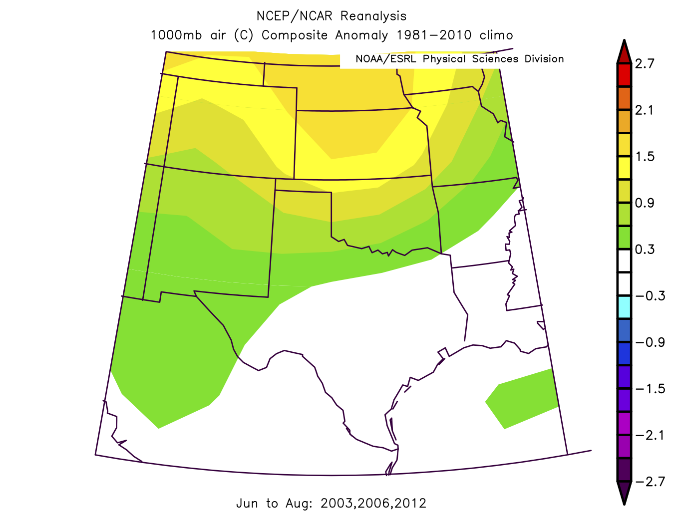
NCEP/NCAR Reanalysis AnomaliesWinter Temperature Anomalies:
Figure 6:When comparing Average MSLP winter temperature anomalies, it's easy to see that low winter temperature anomalies (left) correlate to low yearly Incidence Rates. The inverse is true, with high winter MSLP winter temperature anomalies correlating to the 3 highest years in our study area. Summer Temperature Anomalies:
Figure 7:Summer Average MSLP temperature anomalies tell a much less compelling story. Parts of Kansas are in the same range for our three highest years (right) and our three lowest years (left). However, further study should be done, as the graphs differ much more at lower latitudes. It's likely that threshold temperatures, rather than anomalies, play a much larger role than anomalies. | ||
Begining Statistical Work
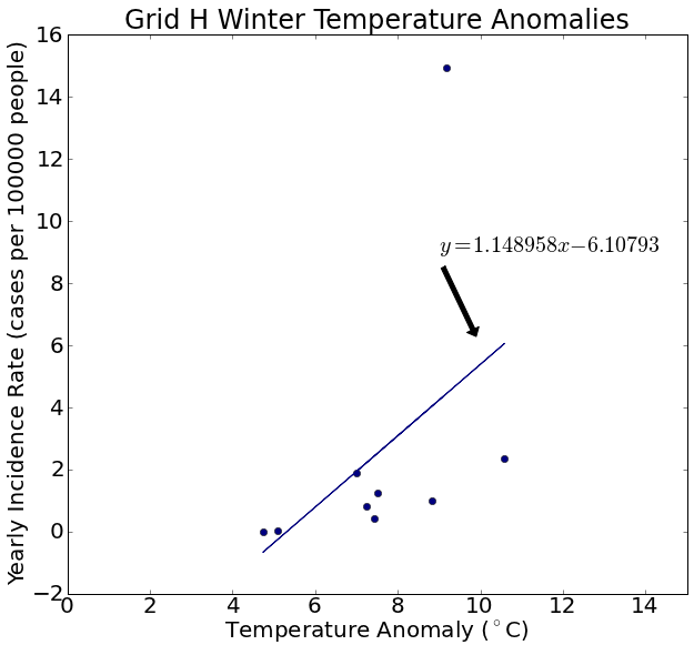
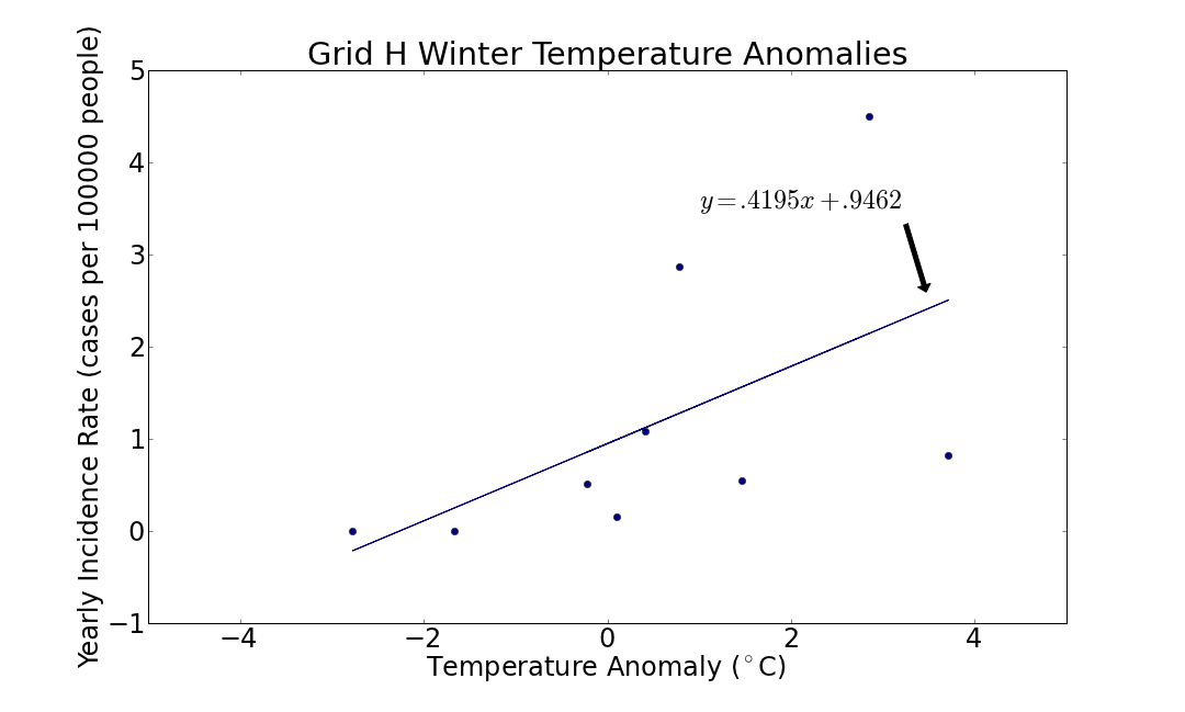
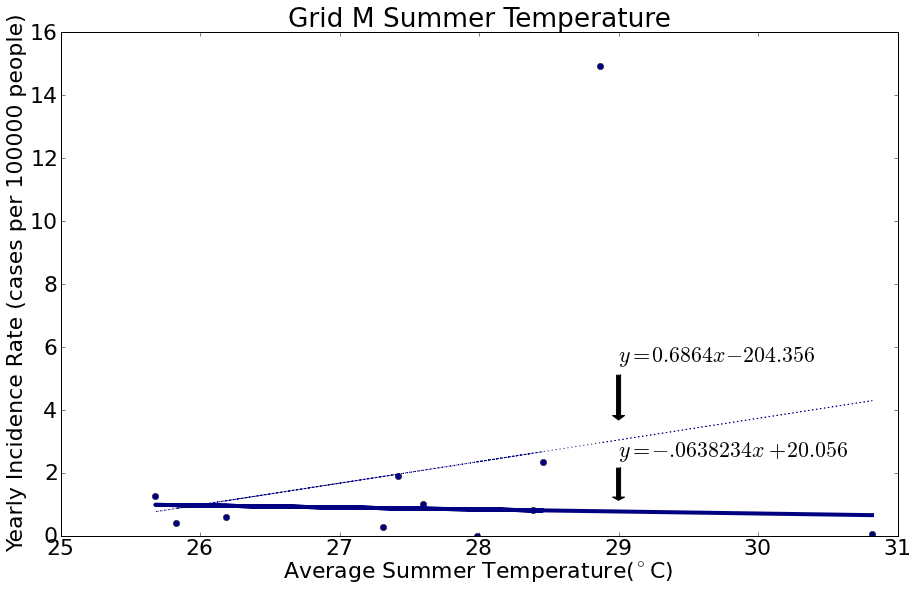
Figure 8:Across much of our region, Winter Temperature Anomalies (top) have a strong positive correlation with Yearly Incidence Rates. As discussed earlier, summer temperature anomalies do not have such a strong relationship. Summer Average temperatures (bottom) also do not have a strong correlation, especially when not considering 2012 (the solid line in the picture) which was an anomalously high year for West Nile Virus in many locations. |
||